6 Tips to Create an Engaging Web Experience [Examples]
Discover six ways your association can attract new members and increase overall engagement through an engaging and enjoyable website experience.
Follow these tips to make your association website easy to use, accessible, and personalized. You'll bring in more site visitors and keep them coming back.
As we reach the quarter-mark of the 21st century, it's a good time to ask the critical question. Is your website up-to-date?
Not just with information—though you should absolutely be reviewing the information on your website regularly. But there are questions you should ask about the overall experience for every user, such as:
Let's look at how you can make sure that the answer to each of these is "Yes." Here are the top association website best practices:

Different people consume content in different ways. Follow these tips to ensure easy navigation of your association website:
Switching up layouts inside your site can be confusing for visitors. Keep your layout, as well as your whole look and feel, the same across your site. This helps reinforce your brand and allows visitors to focus on the message and not the changing look. It also makes it easier for them to find the content they're looking for.
For visitors who like to scroll (and for mobile ease) put important information on the front page. This way, visitors can scroll down the page and access what they need easily. Place the most important information at the top, and provide links in each section for easy access to more details.
Use a clear font hierarchy and white space to organize content as visitors scroll. This visual organization enhances readability and focus, making it easier for visitors to navigate and absorb the content.

Visitors expect to see navigation at the top of the page and/or along the side. In addition, having a footer navigation helps scrollers, because when they get to the bottom of the page, they have options.
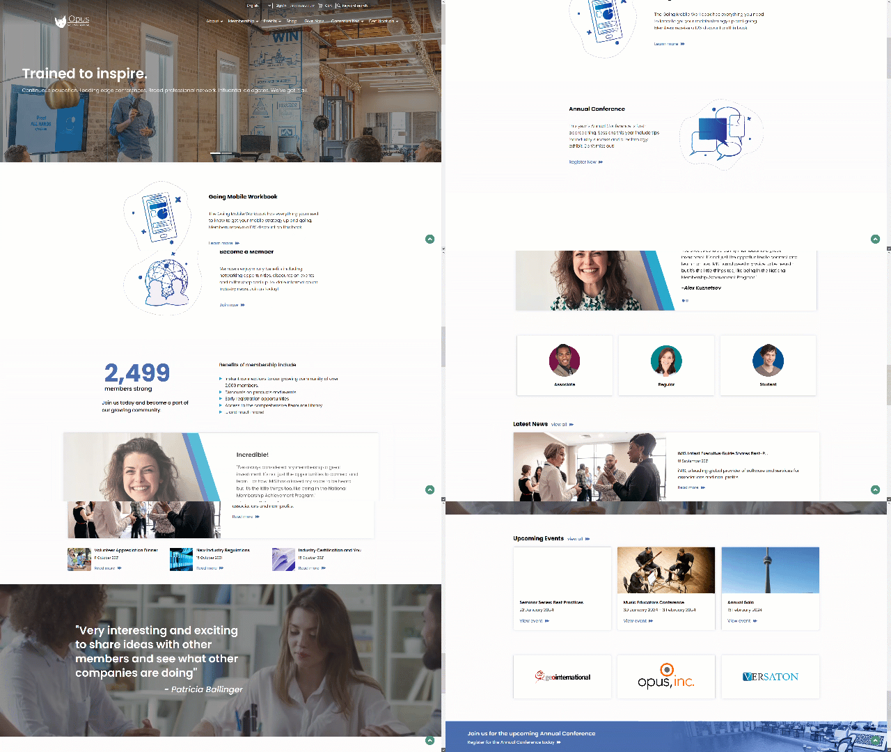
If you're an iMIS user, check out the new Flat White theme released for the iMIS RiSE website module. Flat White has clean and simple, yet effective, design. It includes top and bottom navigation on all pages, and side navigation on interior pages. It also comes with some slick animation options built in.
See an example of Flat White in action on the iMIS Users Group website.
Website accessibility in 2024 is a complex topic. But here are some basics you should follow consistently:

Alternative text (alt text) is a written description of an image on your website. And it's a must for all images on your site.
Alt text should accurately describe the activity in the image. For a call to action (CTA) or navigation image, it explains the action or where the image will take them.
Alt text enables screen readers to clearly describe the image to visually impaired users. This ensures the image has the intended impact, no matter how the website is accessed. Learn more about alt text with this Semrush blog article.
Make sure any link or interactive component on your site is properly usable with a keyboard. Users who can't use a mouse should be able to navigate your site using keyboard shortcuts or tab keys. One important note about this: break up with the phrase "click here."
Screen readers don't know where "click here" takes the visitor. If you must use it, include the action inside the link.
For example, use "click here to download guidelines" as the full link. Or, better yet, just make it "download guidelines."
Various kinds of visual impairment exist, and contrast and color impact many of them. Provide high contrast between your text and your background colors. This helps users with visual impairments read the information comfortably.
And avoid using color as the only means of distinguishing information. "Red" isn't actually red for everyone.
Another aspect of visual impairment is the need to increase the size of the font or the overall website. Make sure that text sizes are readable and that your layout doesn't break when a visitor zooms in or increases the text size.
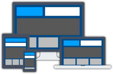
One thing that will help with zooming is good responsive design. Responsive web design ensures a website looks good and works well on any device. It automatically adjusts based on the screen size.
If the site adjusts properly as someone zooms, the visitor will have a good experience regardless of their device. And if a visitor is using a mobile device, responsive design will make the site easy to read and navigate.
Optimize image sizes (both in bytes and pixels) to ensure a quick download time and no pixelation. If image sizes are too large, they'll take a while to display, especially for visitors with slow internet. And if image sizes are too small, they may turn show as blurry. Check out these website image guidelines.

Videos are an increasingly popular way of sharing information. However, videos can be problematic for visitors who are hearing-impaired, visually-impaired and often neurodivergent users. The bare minimum requirement for your videos should be captions and access to a transcript. If the visuals in the video are important, include a descriptive audio option that narrates the visual elements.
These recommendations only scrape the surface of accessibility. For a full list of accessibility recommendations, check out the Web Content Accessibility Guidelines (WCAG). If your association uses iMIS for web development, review the accessibility best practices for iMIS websites.
What's arguably the biggest thing that can make your website easy to use, ensure visitors see you as a resource, and keep coming back? Make the experience personal. Not just personalized, personal.
"Hi <NAME>" is nice, but it's also the bare minimum. After a visitor logs in, make sure the information displayed matches their specific needs. Think of the Amazon experience, only more like the Amazon Experience Plus. You should know members and stakeholders even better than Amazon knows customers.
Use any information you have on those members such as preferences and past activities. The personalized experience should start with the homepage. With the right tools, it's easy to provide news, information, resources, events, and advertising that will resonate with each logged-in visitor.
If you use iMIS as your web development platform, explore IQAs and IQA Template Displays. These allow you to change what visitors see based on their information in the database.
Download our free guide to learn how to draw members in and keep them coming back for more.
You can do everything listed above and still have trouble if you don't make it easy for your colleagues to follow these practices. Use a platform that is WCAG-ready to provide a good base for your colleagues to work with. Provide easy ways for staff to add descriptive text with clear instructions on what that means.
Wherever possible, provide data-driven information that updates itself based on the database.
This will minimize manual work and manual mistakes.

Association professionals are busy, so it's easy to avoid best practices or do the bare minimum. But if you put in the work and build a process for following best practices, chances are you'll see an increase in:
An association platform that knows your members & supporters. Manage member portals, special-purpose microsites, or your entire public web presence.
Discover six ways your association can attract new members and increase overall engagement through an engaging and enjoyable website experience.
A solid association self-service portal should boost member engagement and free up your resources so you can deliver even better service to members.
Boost union membership with a website that showcases your value, personalizes content, and drives member engagement.