
%20Series/2%20-%20Unforgettable%20Web%20Experience/2024-iMIS_WP_unforgettable-web-experience_form-page-top-image-crop1.png)


Association
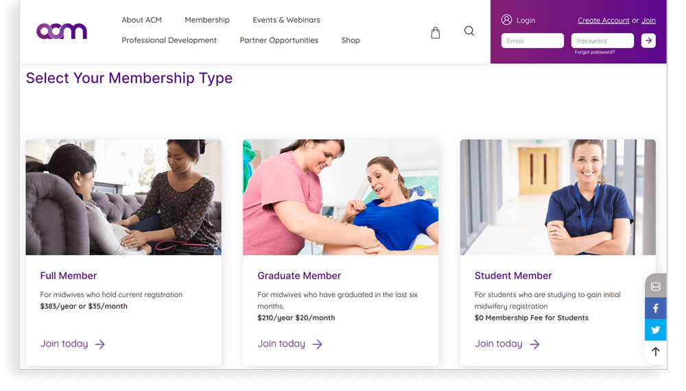
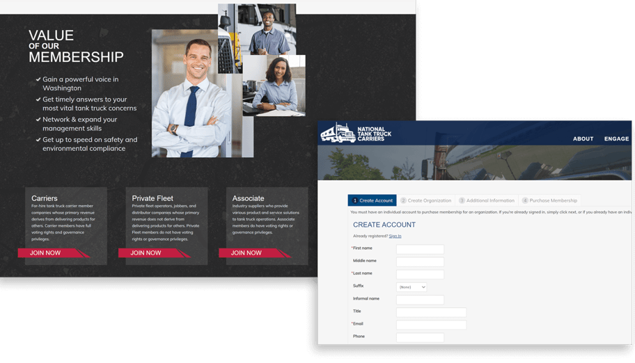
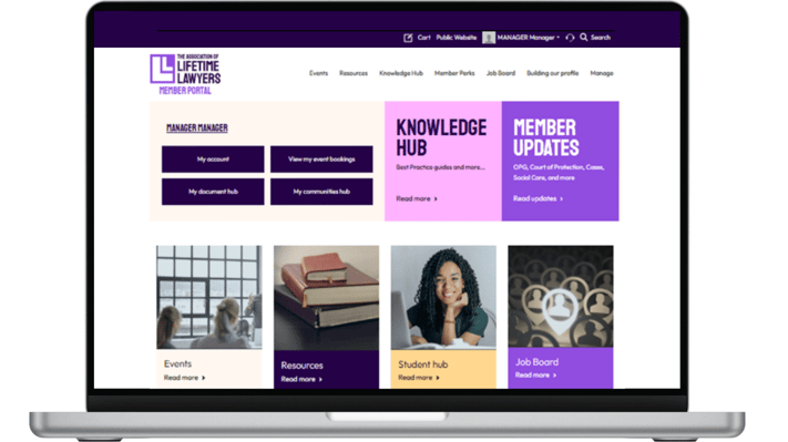
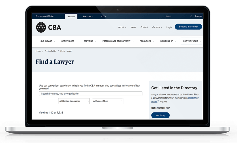
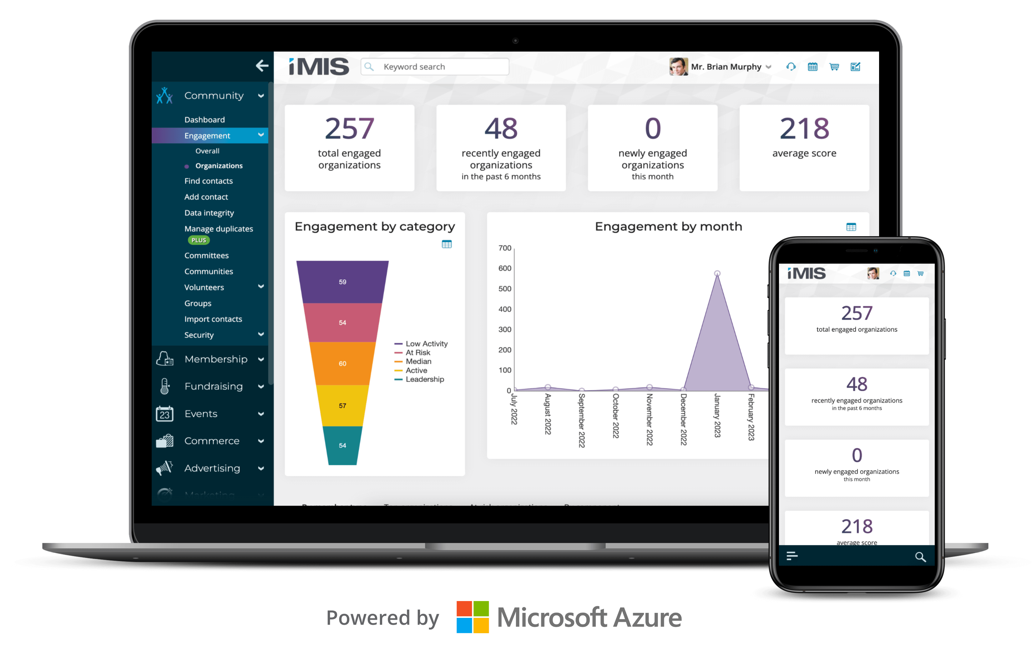
Why Association Members Love a Self-Service Portal
A solid association self-service portal should boost member engagement and free up your resources so you can deliver even better service to members.